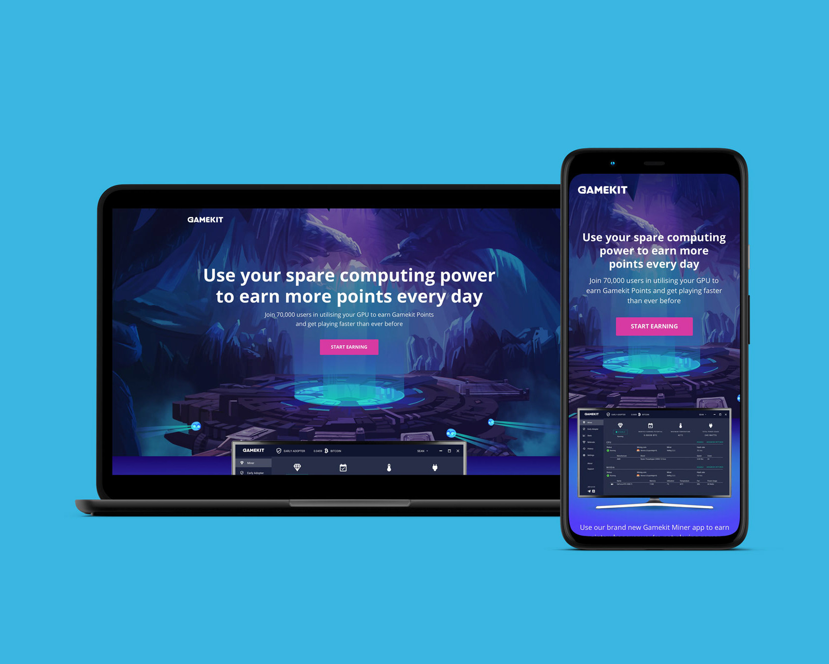

Make Real needed to enhance their brand appearance through their website to create better experience. The aesthetic needed to match what the company does by adding a three-dimensional tone and including strong graphics.


Initially I sketched out concepts which involved using a lot of geometric shapes. These could be used as buttons, tabs, background shapes and patterns. The use of polygons builds a sense of depth and I wanted to incorporate gradients to lift shapes off of solid coloured backgrounds.
I also sketched out some rough wire frames to get an understanding of how the layout would look across different pages where grids were involved, images, big text blocks etc. It is necessary to map out pages so that when it comes to designing it will be more efficient as you have a plan.
Take a look at Make Real's website on desktop and mobile.